Since the wood my tool chest is made from is pretty ugly, I am planning to cover it in a series of colored layers which may or may not reveal themselves as interesting, almost marbleized, patterns over time as the layers progressively wear away. I've never really loved faux finishes or shabby-chic furniture but I do like the idea of the chest looking a little different as time goes on and looking at examples of worn away milk paint layers always leaves me wanting to try it.
I also wanted a base of paint involving the "Extra Bond" additive, which promises to allow the paint to adhere to troublesome areas like knots, which I had a handful of. To that end, I decided on a primer layer which would not be directly visible, but would allow the subsequent colors to eventually wear away and show hints of it. For this, I chose a tan-like color which the paint manufacturers suggested I could blend.
Here is what I was after:
This is the color "Driftwood" from the Old Fashioned Milk Paint Company, combined with 50% white. It is pointed out that the onscreen colors will of course not match the end result, being an understandable and obvious limitation of technology. Nonetheless, I figured this was close enough to the tan I wanted, since I also couldn't be exactly sure of any of these colors and so had to really guess at what 3 I would want together.
The instructions also suggest weighing the paint powder for the most accurate blends. I did not do this, since I really didn't know (and maybe didn't really care) exactly what tone of tan or light brown I would end up with. I figured I could at least have the option of adding more white on the fly if I wanted to lighten it.
So upon mixing it up, I was a bit surprised to have created something akin to Battleship Grey, although with a bit more blue in it. The "Driftwood" color (both on the screen and on the sample card included) did not look very blue to me at all. The white looked very white in its powder form, so I suppose it is some bizarre alchemy between the two colors. The instructions even say that color mixing is unpredictable so always test it on cardboard, popsicle sticks, or a scrap of your project wood.
I don't know if I mind the grey color (it is primer after all) but I would have been pretty annoyed with myself if this had been a particular color I wanted. Perhaps I wanted to match an existing piece or room, or maybe I just really liked a particular color. I said annoyed with myself and not with the paint company because this obviously would be easily preventable by actually testing the mixture first.
It is only to express my surprise that I post this. It is not a complaint. It is also to remind anyone else considering using milk paint to be sure to actually test it first if you care at all about the end results. I knew they would be variable, but not like this!
Here's the chest, in Driftwood + 50% White, aka Battleship Blue-Grey:
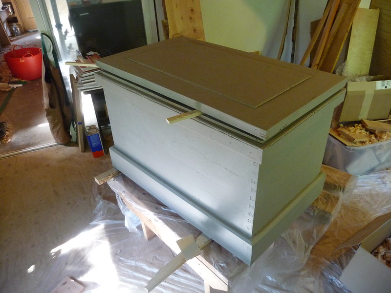
It is a fine base color, even if it is not what I envisioned. I have since put on 2 coats of Tavern Green (which exactly match the color sample sent and more or less match the on-screen example). A little more painting to be done, and then onto the tills.
Looking good. Anxious to see it with the Tavern Green and the tills installed.
ReplyDeleteJamie Bacon
It looks like OFMP made a mistake in what they sent you. It should be much closer than that. That appears more like Lexington Green with 50% white.
ReplyDeleteJeff - the Driftwood powder looked rather Driftwood when initially mixed. I am wonering if the Extra Bond had a role in this? First time using milk paint so I am pretty naive about it all.
ReplyDeleteDo you have any of the Driftwood powder left that you could mix without the extra bond additive? Also, try the Driftwood without the white and see if it is close to the full strength color as advertised.
ReplyDelete